
Some days a top makes your face light up. Other days the same mirror feels a little flat.
That is not your imagination. It is the color.
After 60, skin and hair can shift. Shades that looked great a few years ago may look harsh now. The right colors can bring back that fresh, rested look in minutes.
This guide keeps it easy. You will learn a quick window test to find face friendly shades.
You will also see simple ways to use reds and pinks, calming blues and greens, soft metallics, and clean prints so your face looks bright on camera and in real life.
In this blog post, you will get seven color tips you can try with clothes you already own, plus small tweaks that make getting dressed feel simple again.
Why Shade and Finish Matter Over 60
Skin, hair, and eye contrast change with time. A color that once looked fine can now make your face look dull.
Shop The Look

The right shade brings light to your eyes and softens shadows around the mouth and chin.
Think about three things: how light or dark the color is, how bright or soft it is, and the finish of the fabric.
Very dark, flat colors at the neckline can pull your face down.
A gentle sheen, like silk or satin, can lift it. Bright colors can wake up the face, but if they are too strong, they can overwhelm. Soft versions of the same color are often easier to wear.
Hair color matters too. Silver or lighter hair lowers contrast. You may look fresher in mid-depth shades instead of the deepest tones.
If your hair is darker, you can often handle deeper colors near the face as long as the fabric has a soft glow.
Test in daylight. Stand by a window, place a top or scarf under your chin, and look for clear eyes and even skin.
If you see harsh shadows or sallow tones, swap the shade or the fabric finish. Repeat with one or two similar colors to find your best match.
Use placement to help you.
Keep your best shades close to the face in tees, blouses, scarves, or cardigans. Wear the tougher shades in skirts, pants, or shoes where they will not affect your complexion.
First, find a shade that flatters. Next, choose a fabric that adds life. Then, place that color near your face so you look bright and rested.
7 Color Tips to Look Younger Over 60
Small color shifts can lift your face in seconds. Start by testing shades in daylight and keep the ones that make your eyes look clear and your skin look even.
Next, place those winning colors near your face in tees, blouses, scarves, or cardigans.
The tips below show exactly which shades, finishes, and prints to try first.
Tip 1: Test your best shade near your face
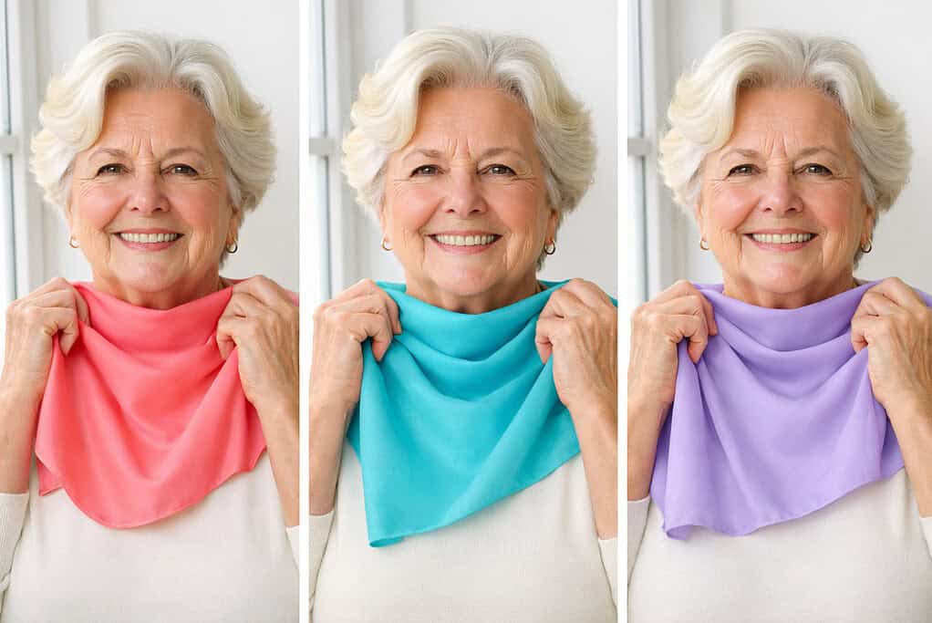
Stand by a window and hold a top or scarf under your chin. Keep the shades that make your eyes look clear and your skin look even.
If you see dull skin or harsh shadows, try a shade that is a little softer or a little lighter. Recheck each season since hair and skin can change.
Tip 2: Match the fabric finish to your skin
Very flat black near the neck can drain the face. A gentle sheen, like silk or satin, bounces light and adds life.
Shop The Look
Use soft shine near the face and keep true matte for skirts and pants. If a fabric glares in bright light, move it away from your neckline.
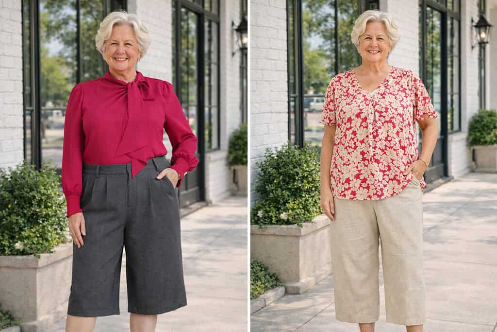
Tip 3: Wear reds that flatter you
Red can wake up the face in seconds. If your skin looks better in cool colors, try a cherry or cranberry red.
Shop The Look
If warm colors suit you, try tomato or coral red. Keep red near the face in a tee, blouse, or scarf. If lipstick is your thing, match it to the red you wear.
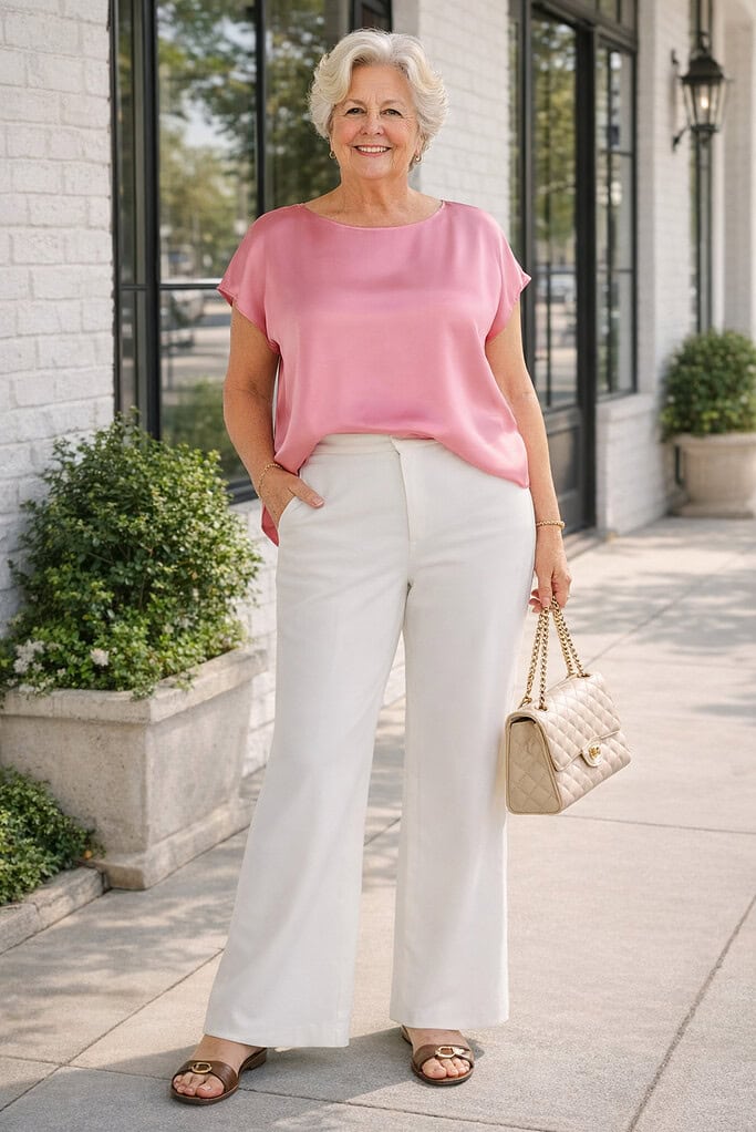
Tip 4: Use bright pinks for a rosy glow
Pink is friendly to many skin tones. Try rose, raspberry, or soft coral and see which one clears your skin and brightens your eyes.
Shop The Look
Keep the rest of the outfit simple so your face stays the focus. If a pink looks too sweet, pick a softer mid tone.
Tip 5: Try cool blues and greens to calm redness
Navy, teal, and soft forest can balance red patches on cheeks or around the nose. Place these colors in tops, scarves, or cardigans that sit close to your face.
Shop The Look
If you flush easily, skip strong red near the face on that day and choose blue or green instead.
Tip 6: Add metallics the smart way
Test silver, gold, or champagne at your neckline. Keep the one that lights you up and softens shadows.
Shop The Look
If none look right close to the face, wear metallics as shoes, belts, or a bag. Aim for a soft shine, not a harsh glare.
Tip 7: Choose prints with clean contrast
Pick two color prints with a clear light note, like white or cream, near the face. Keep the print scale modest so it does not overpower you.
Shop The Look
If a print looks busy under the chin, place it lower or choose a calmer pattern. Vertical elements in a print can add length and keep the eye moving.
Bonus tip: Swap harsh black for deep neutrals
If black near your face feels sharp, try navy, charcoal, chocolate, or deep olive. These shades give you the same polish without the hard edge.
Use black for pants or shoes instead, where it will not affect your complexion.
What to Avoid with Color Over 60

Some colors and finishes can make your face look dull or tired. Skip these near your face and move them to skirts, pants, or shoes instead.
First, avoid harsh, very flat black at the neckline.
Flat black can deepen shadows around the mouth and chin.
If you love black, use it on the bottom, or soften it with a scarf in one of your best shades.
Next, go easy on high-gloss fabric by your face.
Very shiny satin or vinyl can glare in daylight and highlight lines.
Choose a gentle sheen like silk or a soft satin that glows, not glares.
Then, watch out for dusty, grayish colors.
Muted taupe, some beiges, or dull pastels can wash you out.
If a color makes your skin look flat or sallow, swap it for a clearer or slightly brighter version.
Also, limit busy prints under the chin.
Large, tight, or very high-contrast prints can overpower your features.
Pick a smaller scale with a clean light note (white or cream) and keep the strongest prints lower on the body.
Be careful with clashing undertones.
If your best shades are cool, very warm camel or tomato can fight your skin.
If you suit warm tones, icy fuchsia or stark optic white can look hard. Test in daylight and keep what brightens your eyes.
Finally, skip too many strong colors at once near your face.
Two bold shades by the neckline can compete.
Keep one statement color close to the face and let the rest of the outfit stay calm.
Mini Color Outfit Formulas to Look Younger Over 60
To look younger, start with pieces you already own, then swap in shades that flatter your face.
Keep lines clean, fabrics drapey, and colors near your face brightening.
Navy tee + navy pants + cream cardigan
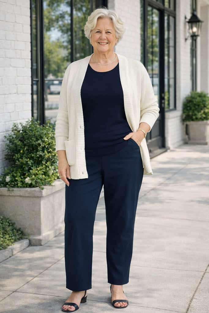
The navy top and bottom create one long line, so your body looks taller and slimmer. Meanwhile, the cream near your face adds light and softens shadows, which makes your skin look fresher.
Shop The Look
Leave the cardigan open so the center line stays long, and let the hem hit mid hip or lower for balance.
If cream feels too pale, swap to soft ivory or light gray so the effect stays gentle.
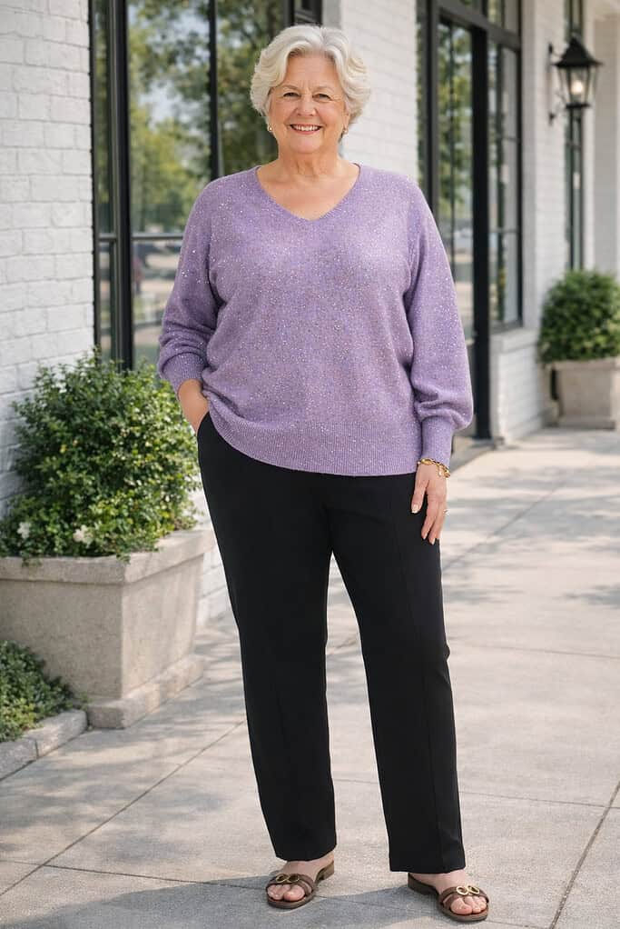
Rose pink blouse + charcoal pants + small silver studs
Rose pink lifts the face, while charcoal grounds the look without the hard edge of black, so the outfit feels calm.
Choose a soft V or open collar to frame your face, which keeps the focus up top. If bright pink feels loud, shift to dusty rose. If your skin reads warm, lean toward soft coral rose so your glow looks natural.
Teal knit sweater + dark jeans + pewter flats
Teal helps calm redness, so cheeks look even and eyes look clear. Pick a knit with a soft sheen so it reflects light without glare. If teal is not your best shade, move to soft forest or deep sea blue, which work the same way.
Add a pendant at mid chest to guide the eye down the center, and the whole look reads longer.
Tomato red tee + tan jacket + dark jeans
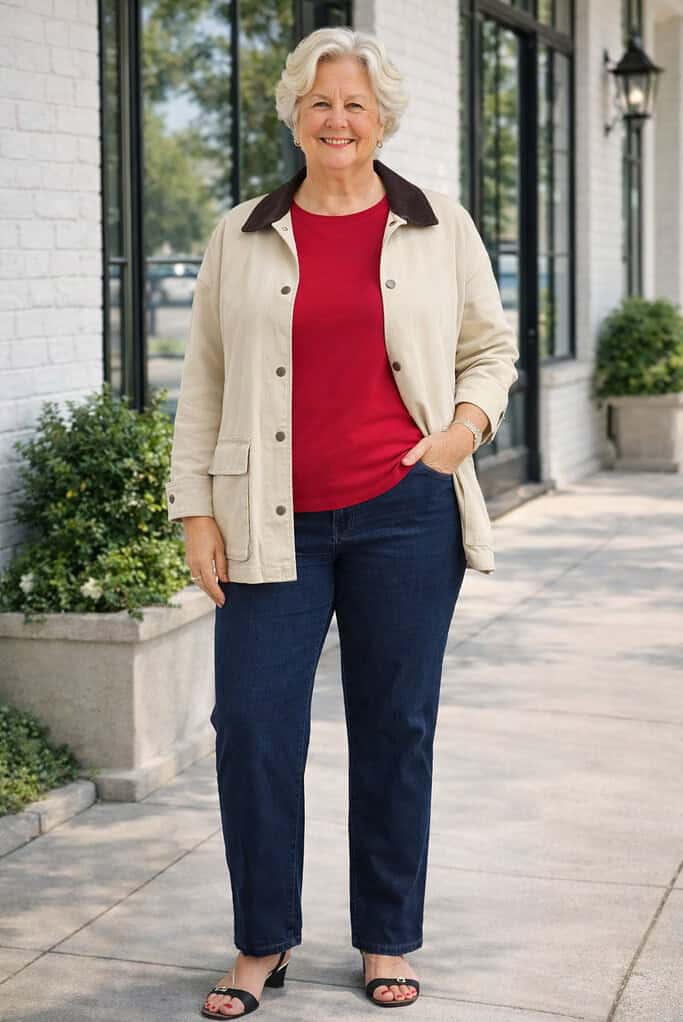
The warm red adds energy, and the open jacket frames a clean vertical line, so your middle looks slimmer. Aim for a jacket that hits mid hip, because the right length balances your shape.
Shop The Look
If tomato red feels bold, step down to brick, coral, or muted rust so the color still lifts your face.
Ivory tee + raspberry scarf + camel cardigan
Ivory lifts the face, while the scarf puts your best shade right under your chin, so your features stand out.
Keep the scarf light so it drapes instead of bunching, which prevents bulk at the neck.
If raspberry is too strong, try rose or berry. If camel fights your undertone, pick taupe so the mix stays soft.
Champagne satin blouse + black trousers + nude shoes

The gentle sheen near your face adds life, so you look fresh in evening light.
Shop The Look
Meanwhile, moving black to the bottom keeps the outfit balanced. If champagne reads too warm, swap to soft silver or pearl gray so the glow looks natural.
To finish, add small pearl studs and a simple clutch.
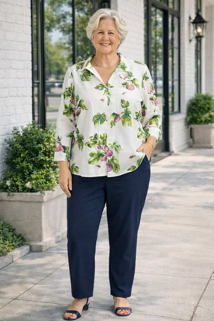
Cream tee + deep olive jacket + print skirt on a white base
Cream brightens your face, and olive frames it, so your features stay in focus. A light-ground print keeps the outfit lively without taking over.
Choose a skirt that skims the tummy and lands at the knee or midi; that way it falls smoothly. If olive is not your color, switch to navy or charcoal so the frame still works.
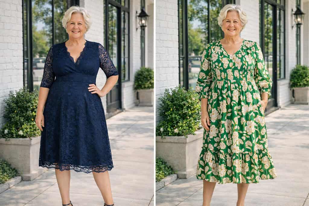
Navy dress + metallic sandals + pearl studs
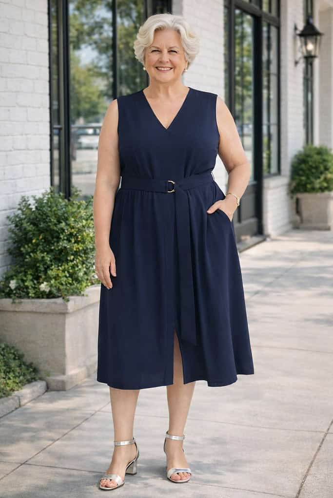
Navy smooths the silhouette, so your shape looks long and clean. Soft metallics lift the face without glare, which is kind in daylight photos.
Shop The Look
Choose silver if you suit cool tones or soft gold if you suit warm tones. If you want extra brightness, add a cream or soft gray cardigan so the neckline feels fresh.
Let Your Colors Lift You Every Day
Color can lift your face in seconds when you use it on purpose. Start by testing tops and scarves in daylight.
Keep the shades that make your eyes look clear and your skin look even. Move tough colors to skirts, pants, and shoes where they will not affect your complexion.
Use the wins near your face. Choose reds and pinks that flatter, cool blues and greens to calm redness, and soft metallics that add life without glare.
If flat black feels harsh at the neckline, swap it for navy or charcoal or add a scarf in your best shade.
Keep contrast clean and print scale modest. A simple two color print with white or cream near the face looks fresh.
A gentle sheen in silk or satin can brighten, while very shiny or very dull finishes can work against you.
Build outfits around what flatters you now. Repeat your best shades in cardigans, blouses, and scarves.
Write down three to five face friendly colors and use that list when you shop.
With these small steps, you will look brighter, feel confident, and make getting dressed simple every day.
Start Your Color Refresh Today

Start Your Color Refresh Today
If you are ready to simplify your closet and build outfits that flatter your coloring, the Free Capsule Wardrobe Guide will help you do it.
This step-by-step guide shows you how to choose a small set of mix-and-match pieces that work together and fit your lifestyle.
You will learn how to plan your color palette, pick items that go with your best shades, and create a calm, wearable closet that saves time every morning.
Frequently Asked Questions
1. How do I test if a color flatters my face?
Stand by a window with even light. Hold a top or scarf under your chin. Keep the shades that make your eyes look clear and your skin look even. If a color adds shadows or makes you look dull, pass on it.
2. Can I still wear black after 60?
Yes, just place it wisely. If flat black near your face feels harsh, move it to pants or skirts. Near the face, add a scarf in one of your best shades or swap black for navy or charcoal.
3. Which red should I wear?
If cool tones suit you, try cherry or cranberry. If warm tones suit you, try tomato or coral. Test both in daylight and keep the red that brightens your eyes and softens shadows.
4. What pinks look fresh on mature skin?
Start with rose, raspberry, or soft coral. Pick the one that makes your skin look clear. Keep the rest of the outfit simple so your face stays the focus.
5. How do I calm redness in my face with color?
Use cool shades near your face. Navy, teal, and soft forest help balance red patches. On days you flush, pick these colors for tops, scarves, or cardigans.
Follow me elsewhere!